
We are so excited to unveil the new logo & brand identity that Fisher Linder Design* made for Supernova Photography. Working with Amanda over the last month on this project was amazing.

Her design has multiple elements that we can play with on our website, deploy across social media platforms, and use in packaging for our clients. The best part of the design process was working with someone who took a deep look at our photography and our individual styles and incorporated those into an identity that communicates who we are. Here's something she wrote in her first presentation:
“Jay, you have such a simple and clean style. Suzanne, you are so crafty and layered. Then I have to think of your end user – your causal, price-conscious bride. What would she/he gravitate to? ”

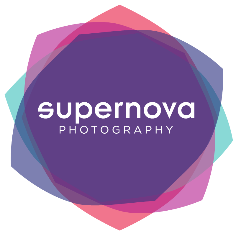
Early on in the process Suzanne mentioned that she would love for the logo to somehow visually represent the bokeh effect that is present in so many of the photos Jay takes. The above image is what she came back with and it immediately blew us away. Again, here's what Amanda says about this image:
“I love how the layered colored graphic suggests a bokeh, a supernova, a flower and delicateness of a veil. ”
We couldn't agree more and are so excited to start using this identity. Thanks, Amanda!
*yes, Amanda and Suzanne are related. What a gift to have so much talent in the family.